How studying trends in human lifespans can measure progress in addressing inequality
People are living longer lives compared to previous generations but, over the last few decades, there has been a hidden shift — they are passing away at increasingly similar ages

Estimated reading time: 7 minutes
This is a trend captured by the Gini Index, also called the Gini Coefficient. Should everyone pass away at the same age, the Gini Index would be zero. This makes the Gini Index a measure of equality, and a Gini Index of one represents inequality.
The Gini Index was developed by Italian statistician Corrado Gini. It is used primarily to study people’s incomes, and to measure inequality.
The Gini Index, typically associated with wealth distribution, reflects the degree of inequality within a society. In the context of life expectancy, lifespan serves as the new wealth — the Gini Index quantifies the disparity between lifespans, wealth distribution and equality.
Integrating the Gini Index with the expected lifespan yields the Gini Mean Difference (GMD).
A global shift
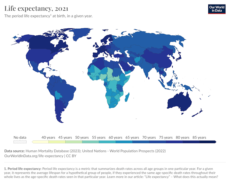
Breakthroughs in modern medicine are pushing the boundaries of human longevity, with life expectancy climbing globally, at different rates. The universal lifespan Gini Index hovers around 0.10 — 0.30 across the world, reflecting a reduction in lifespan inequality.

But individuals are passing away closer to the average age of mortality. This intriguing trend is measured by the Gini Index, reflecting a noticeable global shift with regional nuances.
Some regions show a tighter cluster of deaths around the average age of death than some other regions. While any two regions may show similar expected average ages of death, it is the distribution of ages at death that is of note. One region may show a clustering of deaths around the expected age, while in another, people may pass away across a broader range of ages.
The GMD predicts the anticipated age gap between two random individuals departing this world at a given moment in time in a specific location, and is used to calculate the Gini Index.
Analyzing the data
To validate these findings, our research team used data from the Human Mortality Database, giving us the number of people dying at various ages during specific time frames. This allowed us to calculate the Gini Index and GMD for select countries with available data.
The data we analysed covers total deaths across age categories from 47 countries spanning various decades. Notable findings from six countries — Canada, the United States, the Netherlands, Japan, Poland and Italy — reveal a universal rise in expected lifespan but a significant decrease in the Gini Index over time, indicating clustering of ages at death around the expected age of death.
Japan and Italy showed the lowest Gini Index (0.09) and GMD (14 years) in the 2010s, while the U.S. showed the highest Gini Index (0.13) and GMD (20 years) during the same period. In the late 1800s, the Netherlands and Italy had GMDs higher than expected lifespan and Gini Indexes higher than 0.5, suggesting the expected difference between the ages in two random deaths was higher than the expected lifespan itself.
Based on this analysis, we have identified a reason for optimism: the Gini Index has shown a consistent decrease over time. This implies that on some level, we anticipate people living longer lives and avoiding premature deaths.
Moving forward, there are several scenarios. The Gini Index may continue its decline, resulting in reduced lifespan inequality. Alternatively, it could stabilize at its current levels, or even worsen, leading to a resurgence in lifespan inequality.![]()
Peter Zizler, Professor, Mathematics, Mount Royal University and Shoba Ittyipe, Associate Professor, Mathematics & Computing, Mount Royal University
This article is republished from The Conversation under a Creative Commons license. Read the original article.
What's Your Reaction?


